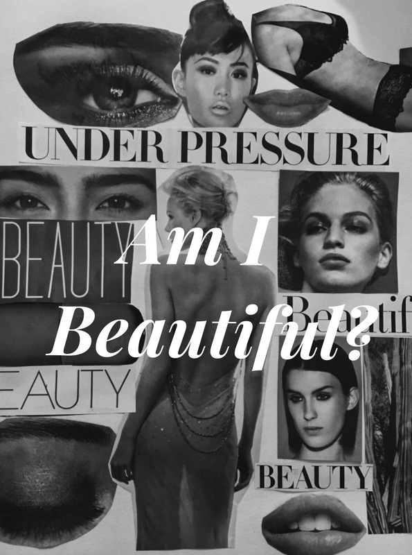
Am I Beautiful?
|
Am I Beautiful?
|
PlanningI began my planning for this peice by skecthing out what ideas I had in mind. I sketched out a number of peices that I was thinking of creating and choose the one that I thought was the best one to represent the meaning behind my peice and show case what beauty is potrayed in society. After choosing what peice I wanted to do, I began by planning what images I wnated to choose to make it my main peice to place the magazine cut outs. As I began to do this I relized that I was better off just placing the images on their own. So I cut out all different types of faces, eyes and quotes to make my piece. The next thing I had to plan out was what I wnated to use to make the words stand out over my peice. I was between acrylic and sharpies, but I thought about it and relized that it was not going to look right so I decied to use Photoshop and just add the text at the end of my piece.
|
Inspiration
Andy Warhol
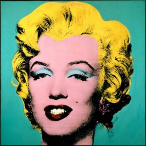
Andy Warhol was my inspiration for my peice. I was looking at vibrant peices and stumbled across this peice. What inspired me from Shot Marilyn was the vibrant colors and the focus of colors on the fetures of Marilyn. This piece looked like something out of a magazine which intreged me to use magazine peices to my art work.
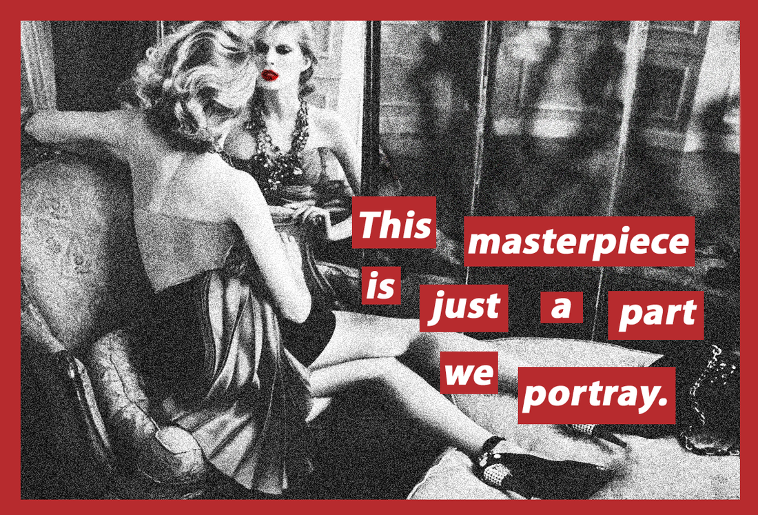
Barbara Kruger
Barbara Krugers art work inspired me to add text over my peice and bring a message out. When I was creating my piece I didnt know how to potray my message, but then I remember that Barbara Kruger alwyas put text over her work. I incoperated her influnce on my work by adding the text "Am I Beautiful?" |
Process
I began creating my piece by going through magazies and cutting out certain fetures of the models in the magazines. I selected what features I wanted to cut out by what caught my attention and what an image of what society belives is beautiful. Every image I selceted had to have an impact on me so it would bring attention through out my entire piece. I had all of the peices of the magazines that I needed I then followed then to cut and paste them on a piece of paper. The peices that I had cut out I then cut them according to their shape rearanged them multiple times till they looked right. With all the peices being reranged how i wanted them, I followed to glue them down. Since the base was now down, I had to then take a picture of my piece and edit it. I eidted it by making the image of my piece black and white. I added a high contrast so the images would have a deeper look to them. The final thing I had to add was the text to my peice. I used photoshop and picked a font that would stand out and picked to make it white so be the firt thing the viewer sees and then their eyes would flow around the background of my peice.
Reflection
This peice has a lot of meaning behind it and I love the fact that I was able to showcase it. Overall Im very happy with outcome and look foward to working with different types of medians and combiding them together for future art works. When I began to create my peice I didnt encounter any diffculties. My process for this peice was easy and fast. A big success in this piece was the background. Im exteremly happy about the outcome of the background. Even though I had to rearange it multiples I was able to have everything flow together. Even though this peice came out great, I believe that if it was planned out properly it could have looked better. I didnt know how to plan this piece, I just had an idea and went with it. If I could go back I would add more images from the maganzie to make it a lot bigger. Another thing I would, would be a different font and color. If I were to it a magazine feel to it more I belive it would have gotten the message a lot better.
